MM006 – IBM Planning Analytics Workspace: Self-Service Analytics is here!

What is PAW?

IBM Planning Analytics Workspace (PAW) is a new web-based user interface for IBM Planning Analytics (TM1) that supports multidimensional self-service analytics, what-if scenario modelling and data manipulation. PAW allows users to easily explore data and create dashboards, enhancing planning, budgeting and forecasting analysis and reporting. It is an additional tool besides web-based interface Tm1Web, the cube viewer functionality and the Planning Analytics for Excel.
Its distribution is important because highlights a common trend in the industry: the shifting towards integrated, dynamic and adaptive self-reporting systems. These systems improve decision-making and effectiveness of business users of every departments and skills level.
[Want to know more about Self Service Analytics? Click here]
An Example

To understand its basic concepts and explore some of its functionalities, we may take, as an example, a business production analysis of an electronic components’ firm.
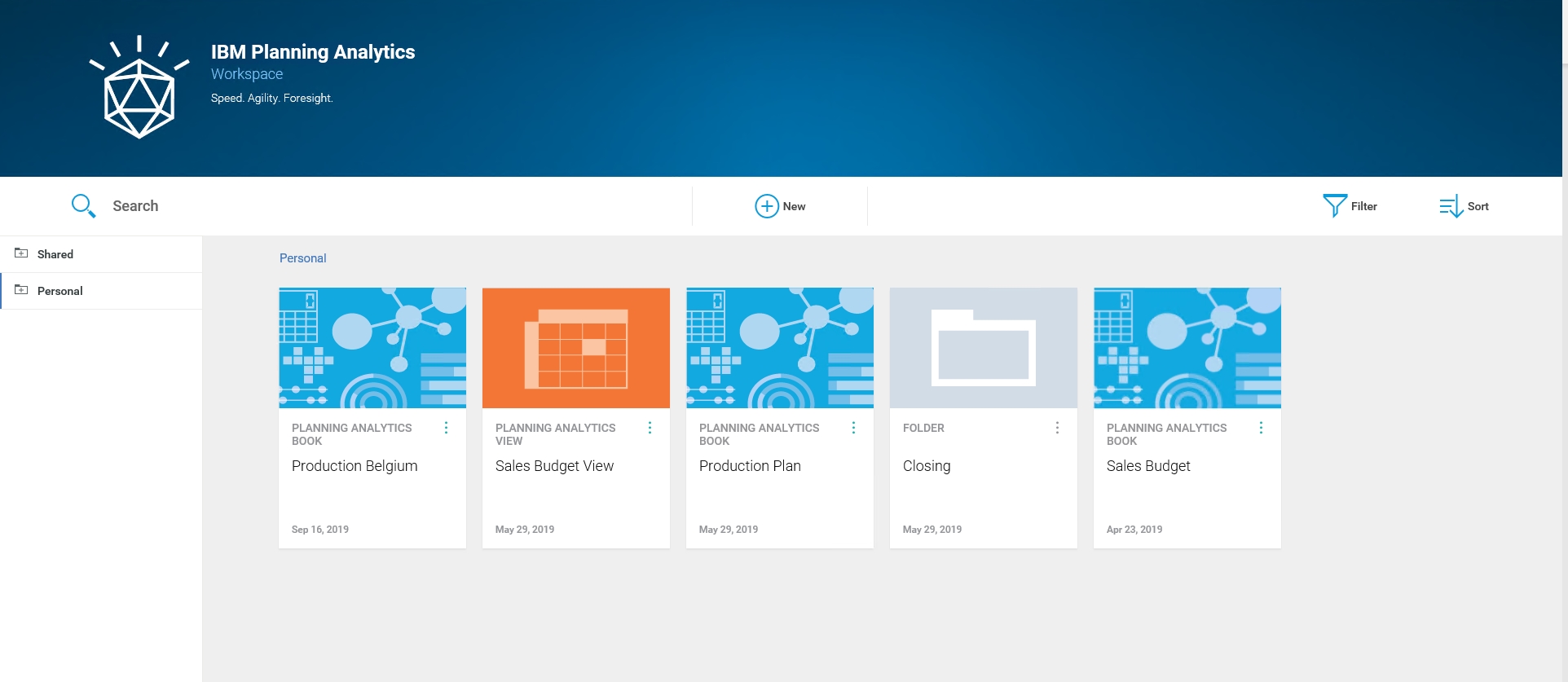
In the main page of PAW, each user has both a personal and shared workspace, which contain books and views. In a book, data can be organized in one or more sheets in the form of views, websheets, scorecards, chart, videos and embedded web pages.
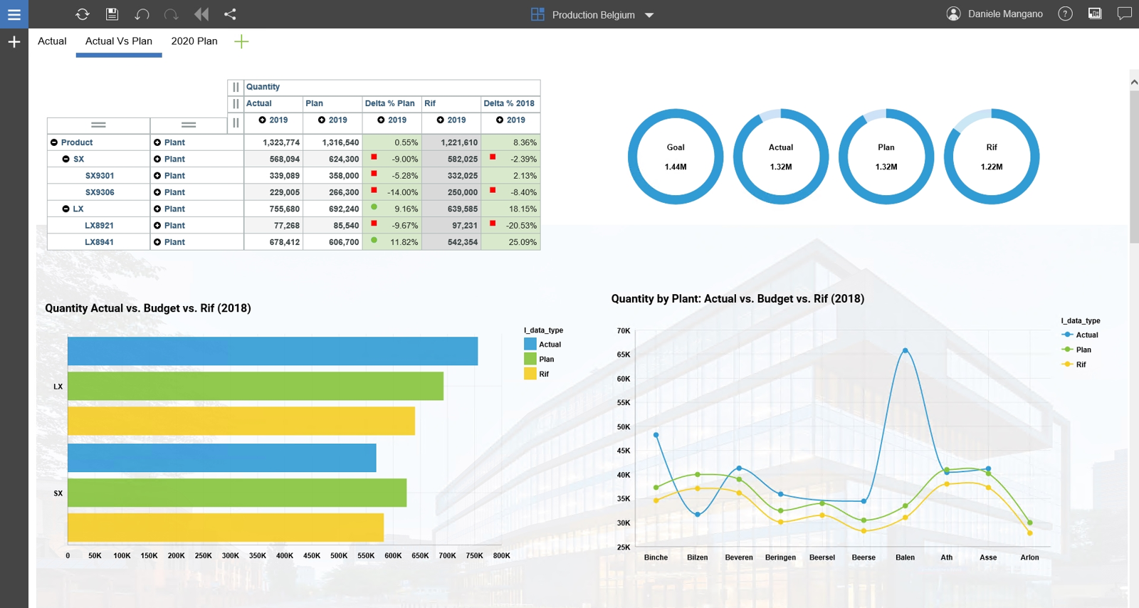
In the book Production Belgium, the sheet Actual is an interactive and dynamic dashboard that provides managers with a quick snapshot of the production business function located in Belgium. It reports useful information about plants purpose, production and capacity, actual volume versus expected goal, as well as defects curve over the period.
The slide selectors on the top right allow users to choose an individual Plant and Product. The charts below are synchronized with one or both selectors and update accordingly.
Looking at the dashboard, a quick insight we can get is that the actual production level is lower than the expected goal. Binche plant overperforms the other ones with over 170 k units produced, while Arlon is one of the worst plants in terms of production and quality levels. LX8941 is the product with most units produced (679 k) followed by SX9301 (340 k).
The first chart on the left compares the actual number of units produced (green line) with the business goal in percentage points (Delta Goal %). A positive delta is a favorable situation, while a negative one occurs when fewer units than expected are produced. Bilzen, Beersel and Arlon are below the production goal, with a negative delta of 25% for the last two plants. Defect chart highlights that, in the first four months, Arlon plant production shows a greater defectiveness than the average. Notwithstanding quality issues has been resolved over time, the production level was much lower than expected.
Beersel productivity seems instead not linked to irregular defects rate or path, rather, to different reasons, such as machine failures or extraordinary activities, that prevented reaching its full capacity.
Blizen has been affected by major defective problems in March and July, leading to a plunge in production compared to the previous and following periods.
The Actual Vs Plan Dashboardpurpose is to compare the achieved results with planned ones and those of the last year (Rif), in order to evaluate plant performance and goal achievement.
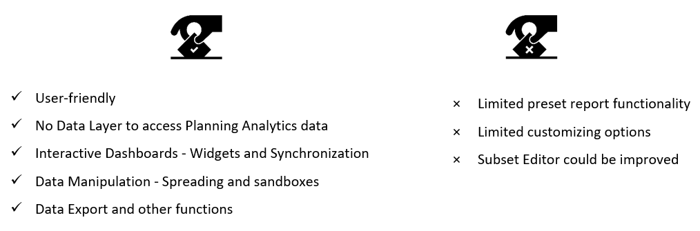
The analysis illustrated above was just an example of PAW’s features and possible uses. Overall, PAW is an excellent solution for planning and data analysis, whereas still some improvement is needed as regards reporting capabilities.
Our review (in a nutshell)

Planning Analytics engine and functionalities, combined with quick and simple report capabilities, make PAW a powerful tool. However, there is still significant room for improvements in reporting features and customization options.